Erica Hines | Brand Experience Designer
Cart 0

 Hexagon AB Corporate
Visual Brand Design and CMS Bynder Development & Implementation


Art Direction | Graphic Design | Brand Guidelines & Standards | Logo & Brand Asset Creation | Data Management System Development | Marketing Materials | Web & Email Design | UI/UX Sitecore Framework | Video Graphics

Corporate visual brand guidelines and implementation

Updated and refreshed Hexagon’s creative brand resulting from an extensive ideation process that identified the company’s brand personality as “the pragmatic visionary”. Erica designed the enterprise brand ecosystem for all print and digital marketing assets and structured graphic components that reflects the visual manifestation of their core message “empowering an autonomous future” with one-of-a-kind sensory data technology.

Unified Hexagon’s refreshed brand and standards across multi-divisional global offices through managing the new implementation of a shared data asset management (DAM) system and quarterly brand audits. The result allowed Hexagon to strengthen its visual identity and brand narrative.

Designed digital graphic assets, iconography, photography standards, and web components for efficient use within Hexagon’s multidivisional global network of marketing, design, video multimedia, and trade show sales teams.


Custom-designed graphic asset evoke their refreshed brand tone that included a collection of vector illustrations, image overlays and iconography with step-by-step instructions to aid in consistency and ease of use between company’s divisions. Managed organizing and distributing of all vector graphic libraries and design guidelines into their respective kit of parts for accessibility on Hexagon’s new digital asset management system.

Each component was designed and extensively tested to work responsively across all marketing collateral including enterprise sitecore framework, presentation documents, social media, corporate videos and various technical SaaS systems.


Hexagon AB Corporate Video
TeachX Task Assistant App - UI/UX Design

Art Direction | Graphic Design | Ideation | UI/UX | Logo & Identity Development | Marketing Materials


🏆1st Place Hackathon winners:


⭐️ Best Prototype
⭐️ Best Landing Page
⭐️ Best Logo Design

During the fall of 2017, I had a wonderful opportunity to participate in a 48-hour hackathon challenge hosted by Goodie Nation, a startup accelerator organization in Atlanta, Georgia.

I collaborated with an amazing team that swept the competition’s grand prize categories from Best App Prototype and Marketing Platform, even down to Best Logo and visual design, by yours truly. We all enjoyed working together, racing against time and bringing the TeachX mobile app to life. We hope it will be a great start toward creating much needed relief for over-allocated teachers and assist marginalized students more.


The Challenge

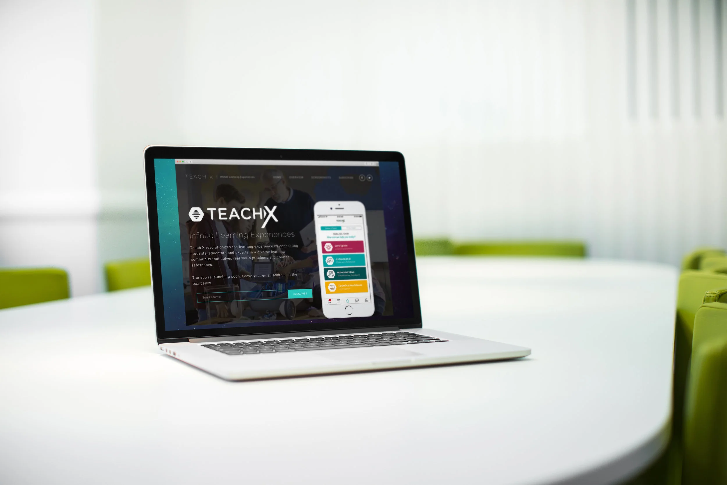
Within 48 hours, our masterful team (having never met before) partnered up and threw ourselves into the fire designing and successfully building out the TeachX app prototype. We also created a handy landing page to provide an overview of the app’s core functionality. It’s like a Task Rabbit app but for teacher’s helpers, and the “helpers” are professional experts of their respective “tasks” that connect within a school’s regional community.

To name a few examples… If a teacher is over-allocated, a helper (an expert established within the community program) can assist with grading papers, give career talks or maybe provide expert demonstrations caring for the classroom pet. If there are specific student behavioral issues or bullying, there’s opportunity for a teacher to schedule an immediate request for vetted professional counselors or a social worker to give talks to students in detention. The TeachX founder ensured this program has a full process strategy established along with a security implementation plan where it could potentially work within local school systems that adopt the app service.

The Branding

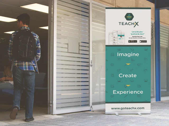
The founder wanted to maintain the essence of her original “busy bee” theme and keep the classroom aesthetic as a familiar look to teachers. While much of the artful classroom styles can be playful and fun, it can also feel busy in a way that’s overwhelming. I felt it was important to keep the logo minimal along with the overall brand look and feel. The design’s emphasis on geometric shapes help play off of the bee honeycomb structure as a visual narrative for connecting the community of users. By saturating the pops of color, also based off the founder’s original palette, the app refresh still upheld to the vibrant schoolhouse feel without compromising its market to adult users. Keeping the iconography system clean and consistent was also high priority to provide seamless way-finding for users and limit hangups when navigating.

The Hackathon Champions

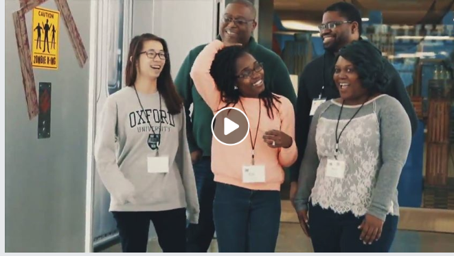
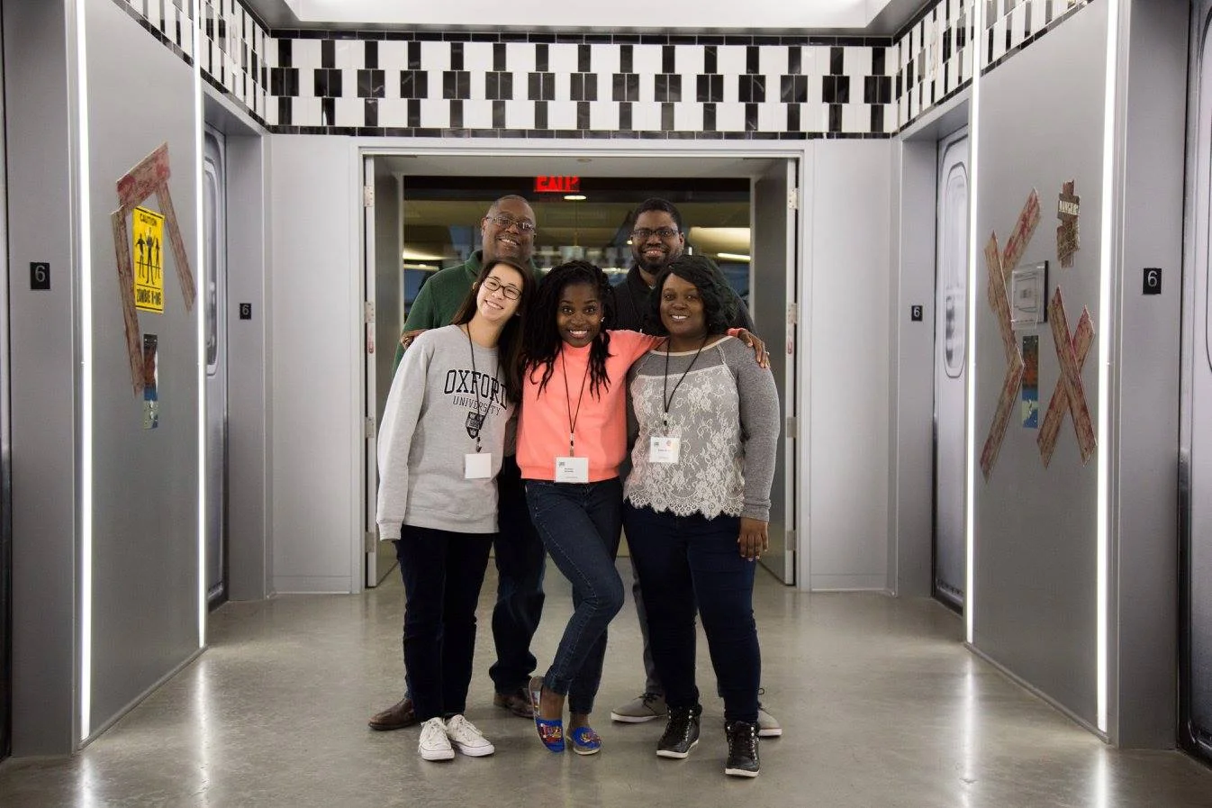
Our rockstar team included the TeachX founder, Monique Nunnely, UXers, Tien-Tien Cheng and Eric Palm, as well as web developers, marketing experts and myself. We were able to successfully prototype, design, and pitch our concept to 6 different panels of industry experts in the last remaining hours of the hackathon at the Atlanta Google office.

The TeachX “teacher experience” app will revolutionize the teacher’s aid experience and immersive learning processes for all by connecting students, educators and professional experts within reach of their respective diverse communities. We hope this is an effective first step that will solve real world problems for our underserved educators especially within marginalized neighborhoods, and also open up more safe spaces for those involved in local school systems.

Before (left) and after app redesign and new branding (right)


GoTeachX.org

⏯ Held at Google's Atlanta office, this 48 hour hackathon featured volunteer UI/UX Designers, Digital Marketers, Web Designers and Graphic Designers who joined the startups in the Hack The Violence Pre-Accelerator to turn their ideas into clickable products, landing pages, logos, user acquisition strategies, and revenue models.


Delta Kids Logo Design


Graphic Design | Logo & Brand Asset Creation


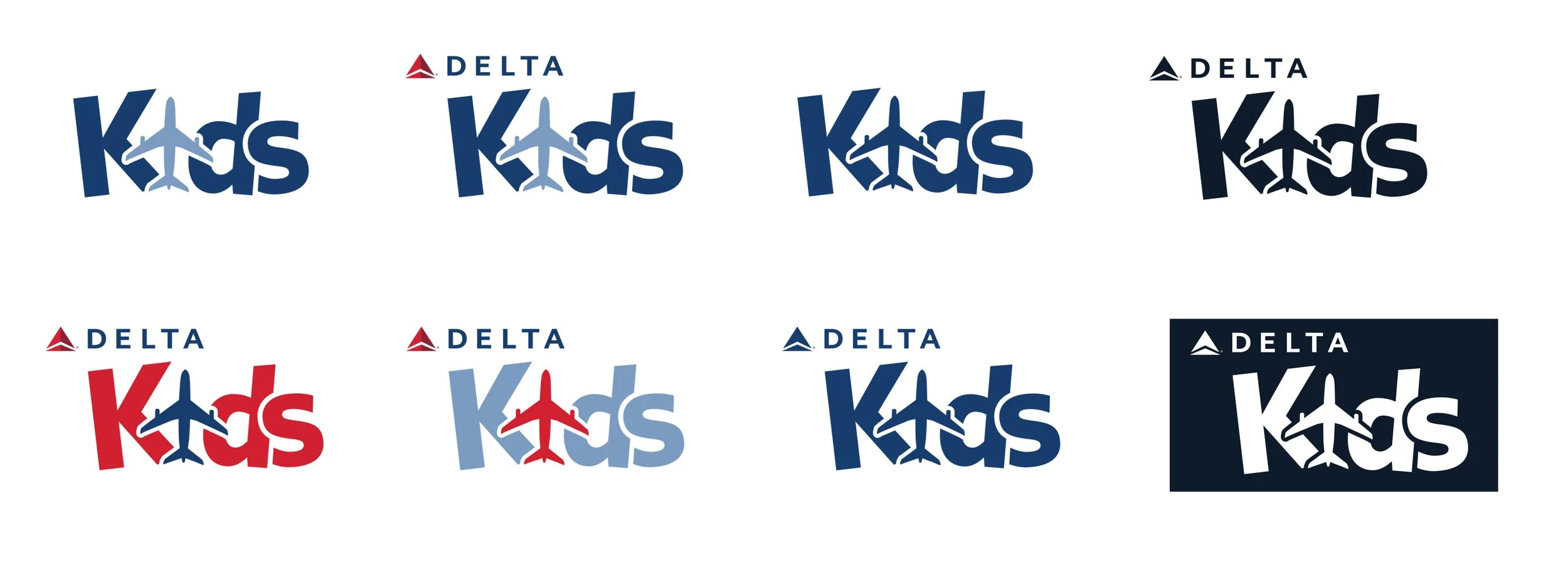
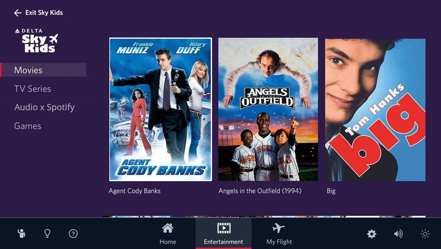
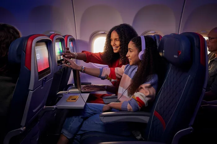
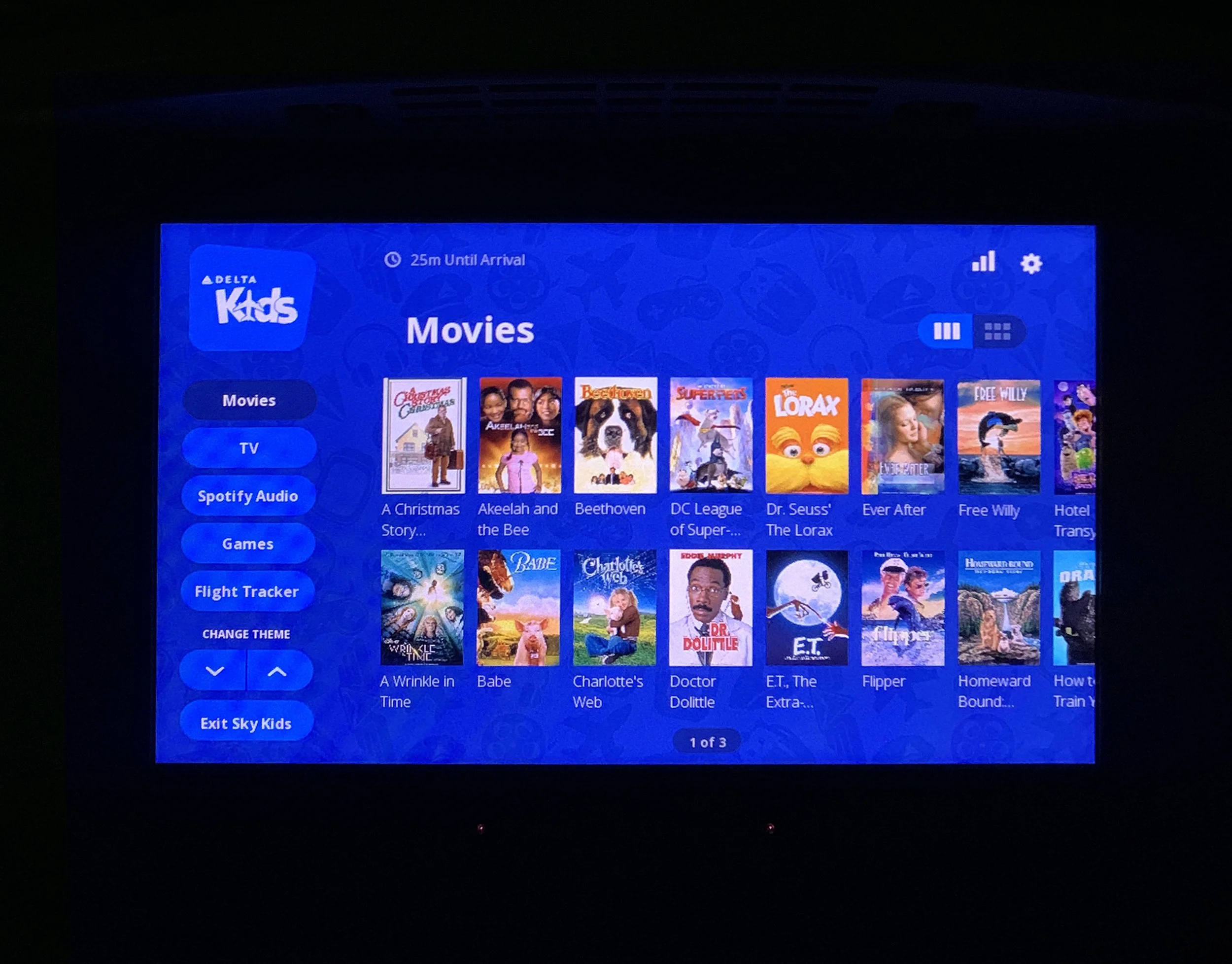
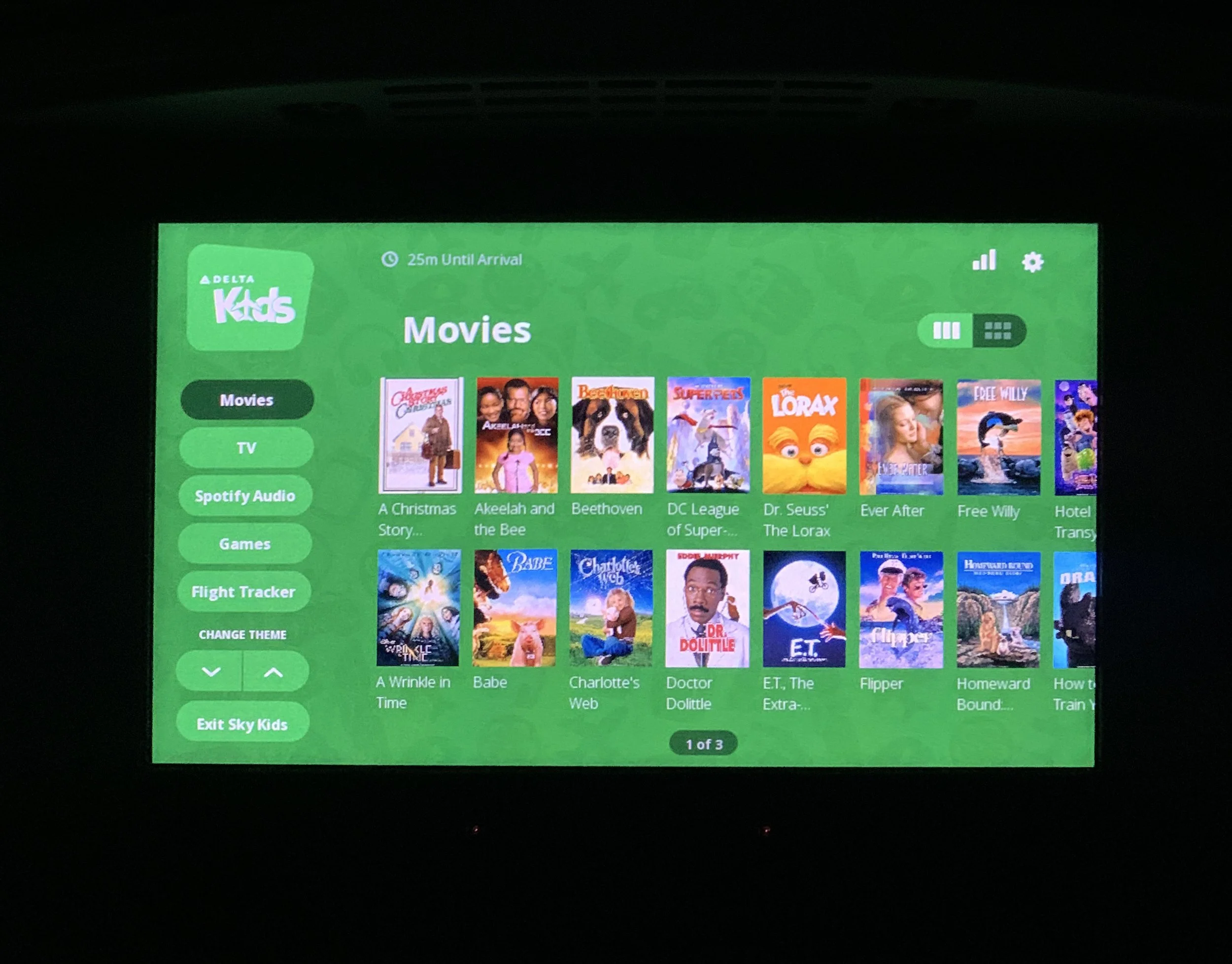
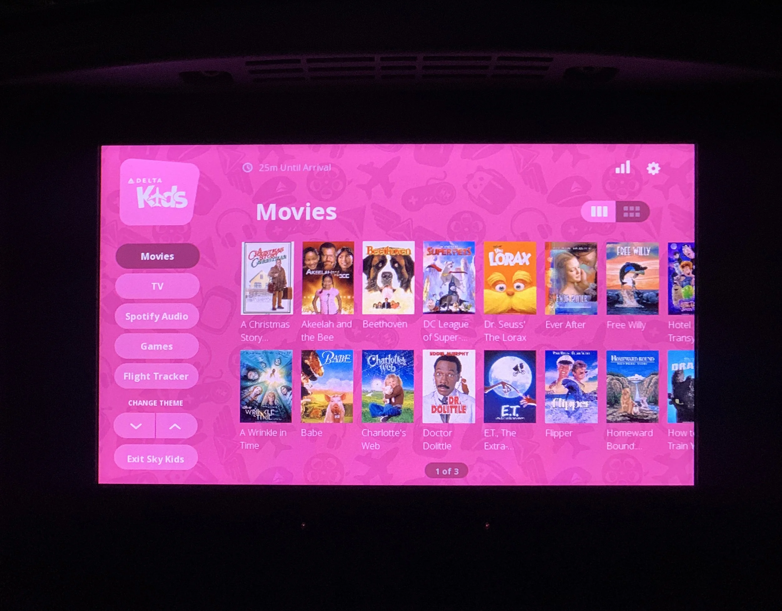
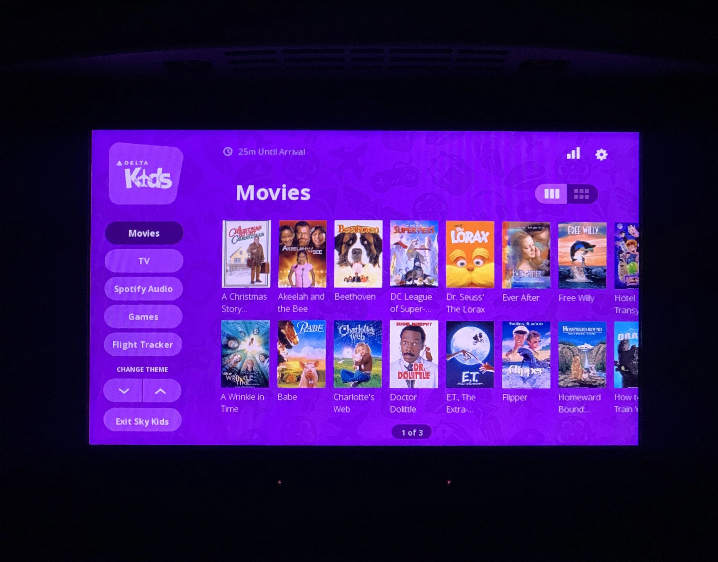
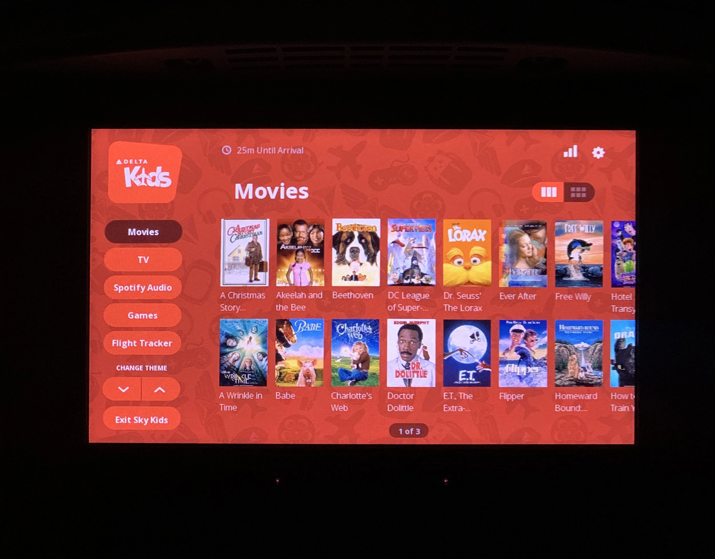
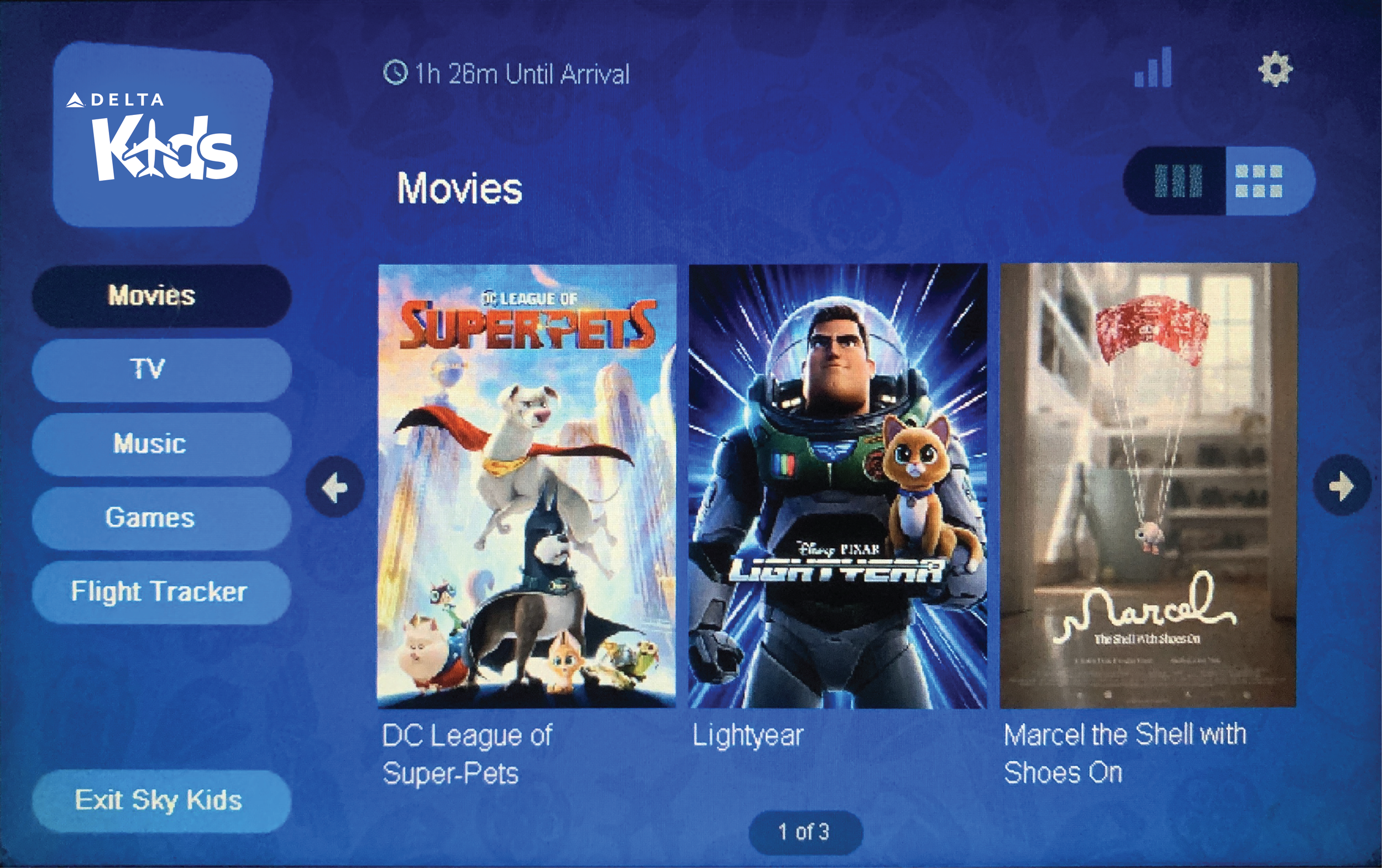
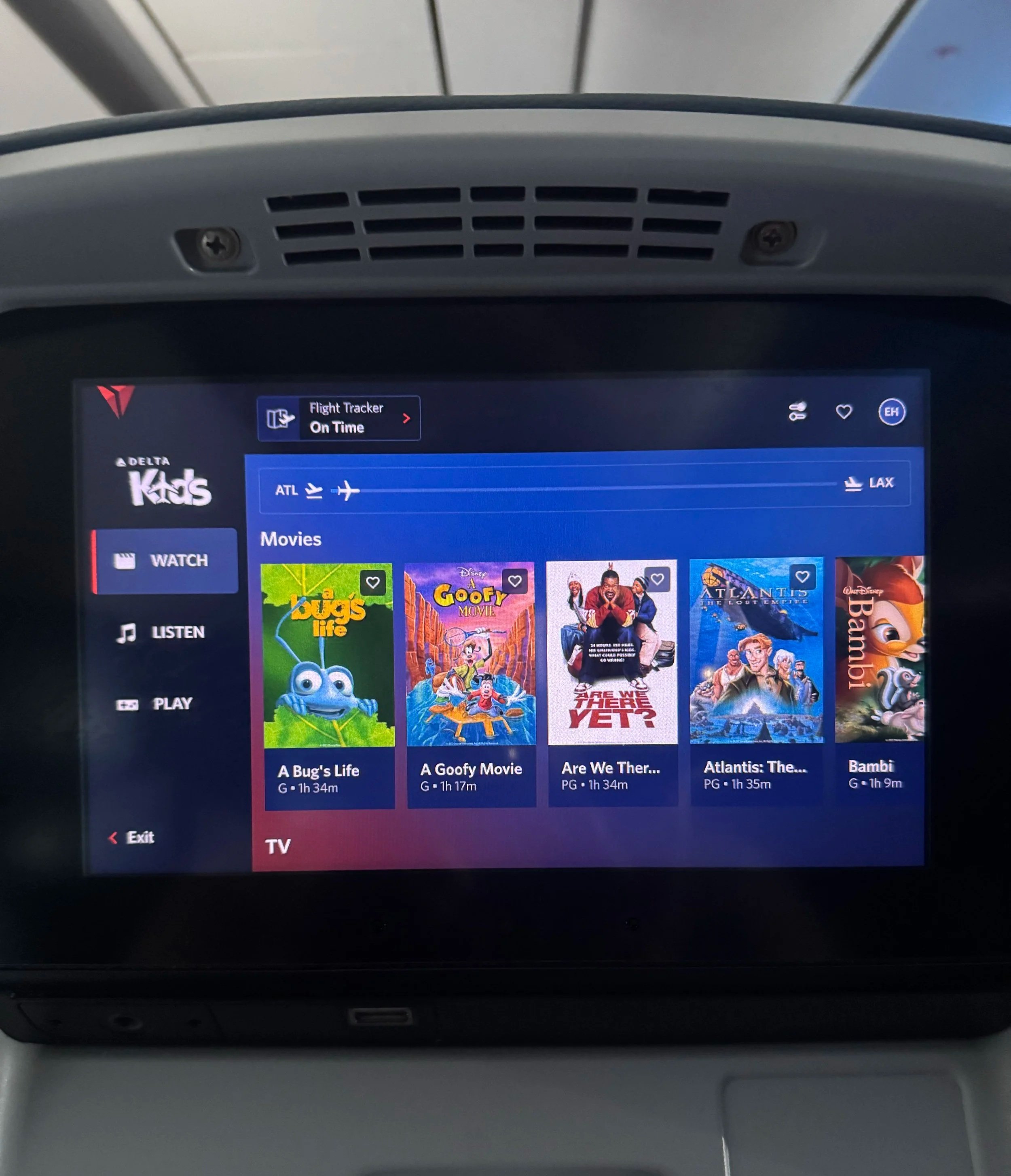
Designed the Delta Kids logo system for Delta Air Lines. The onboard experience has digital seat screens that feature a section for young Delta flyers to enjoy over 30 hours of family-friendly entertainment, including movies, tv series, and in-flight digital games in the DELTA STUDIO® dashboard.

previous logo


 48Forty Brand System


Logo Design | Identity Development | Graphic Design | Advertising / Marketing Collateral


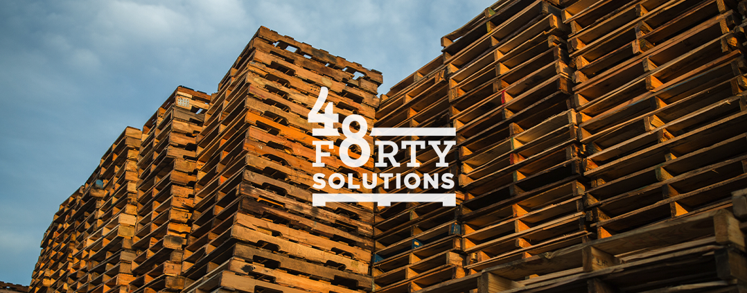
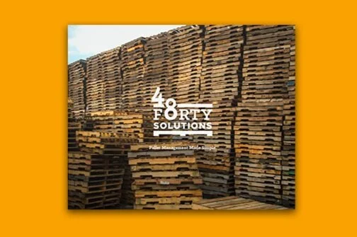
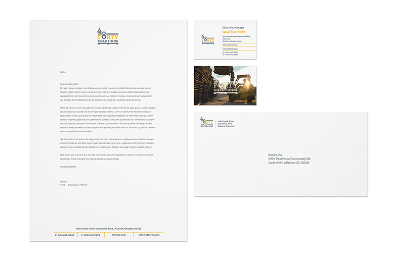
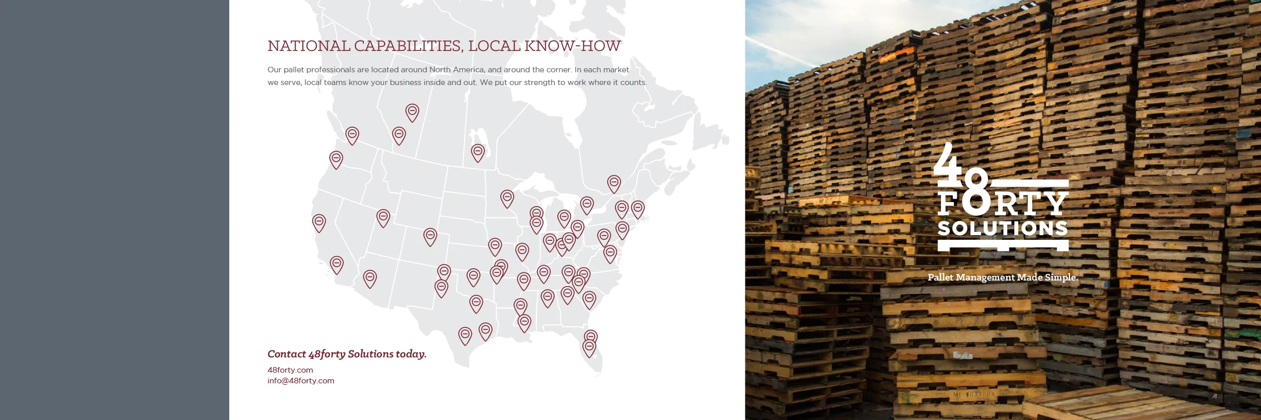
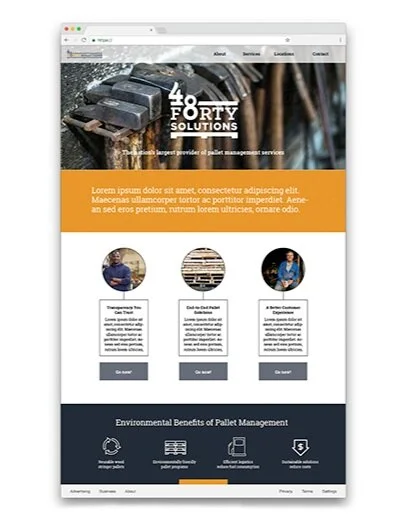
The 48Forty brand system was birthed through a spin-off of CHEP’s recycled wood pallet business. They needed a new name and brand identity to establish a new market presence without losing sight of their company’s extensive 60 year history forging wood pallets for the global supply chain industry. Discovery included review of existing materials, collaboration on naming, and identifying personas for the B2B market. Through the ideation process, the logistics industry’s perception in relation to sustainability was top of mind. I was able to develop a fitting logo with a consistent visual identity, iconography and overall clean aesthetic. The designed items included brand guidelines, apparel, office branding and various marketing collateral pieces that were an extension of those designs.

Branding:
• Logo/Identity System
• Color palette
• Typography
• Photography
• Apparel
• Icons & Graphic Assets
• Sell Sheets

• Print Ads
• Presentation Deck
• Website
• Stationery:
- Pocket Folder
- Business Cards
- Envelopes
- Letterhead


 Metro Atlanta Chamber of Commerce
Economic Impact Report Brochure and Website

Art Direction | Graphic Design | UI | Infographic design | Copywriting | Typography | Photo Retouching


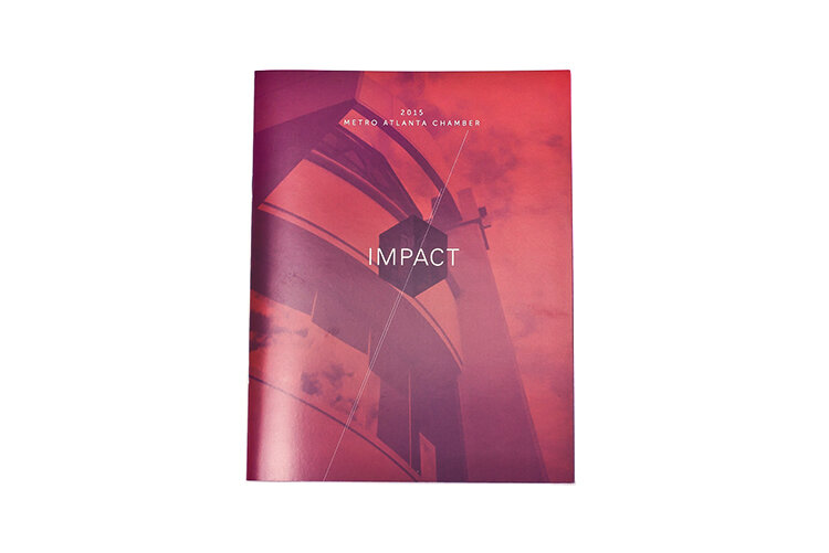
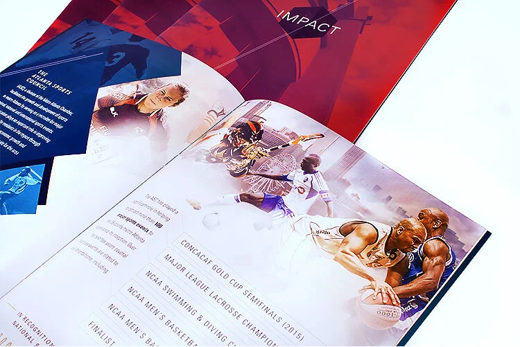
The 2015 MAC Impact report highlights the Metro Atlanta Chamber and the Atlanta Sports Council's collective efforts to advance economic growth, enhance the business climate and the quality of life in the region. The printed brochure and responsive website were created to display key MAC accomplishments, provide investors with an overview of their contribution's impact as well as increase member retention with the Chamber. Took inspiration from various sites in Atlanta and the momentum of the city’s motto of constantly being “on the rise” and created a clean look with geometric shapes, unique color combinations, and directional elements to show movement and engage readers and Chamber members with the MAC/ChooseATL new stats and brand messaging.


Created an evergreen banner for the Atlanta Sports Council to use in marketing materials that also reflects the multifaceted arena of professional sports covered within metro Atlanta.


 UPS Marketplace Video
Graphic Design | Storyboard | Vector Illustration
Animation by James Kowalski


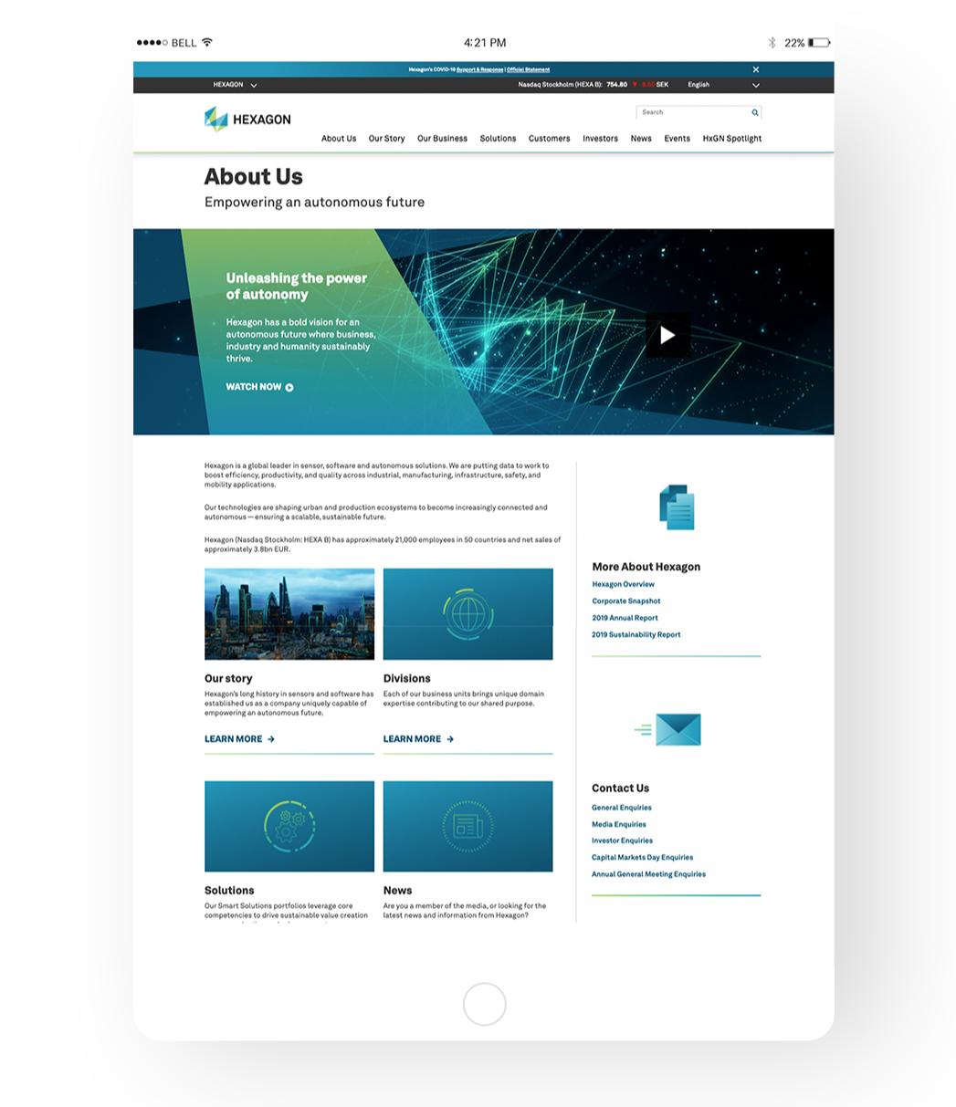
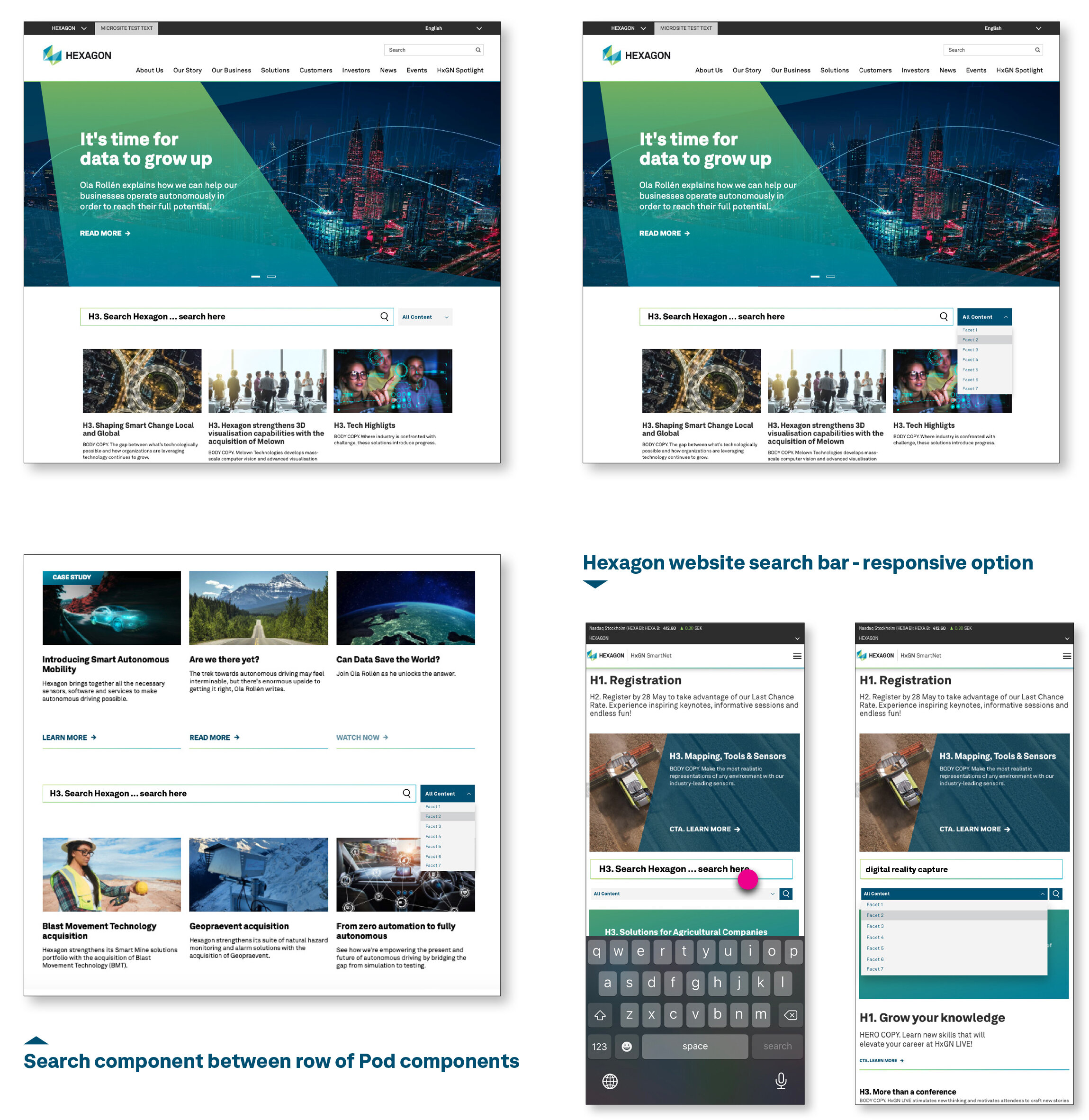
Hexagon AB Website UI/UX

 Graphic Design | Web & Email Design | UI/UX Sitecore Framework | Brand Guidelines & Standards

Creative brand assets and elements applied to sitecore framework, UX/UI testing on web and various app platforms and email builders.